

The DOI matches its Crossref record; 71 of the 72 references it cites were found in a registry or an index.
A comparison of marker gene selection methods for single-cell RNA sequencing data
Open accessAbstract
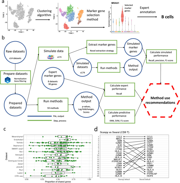
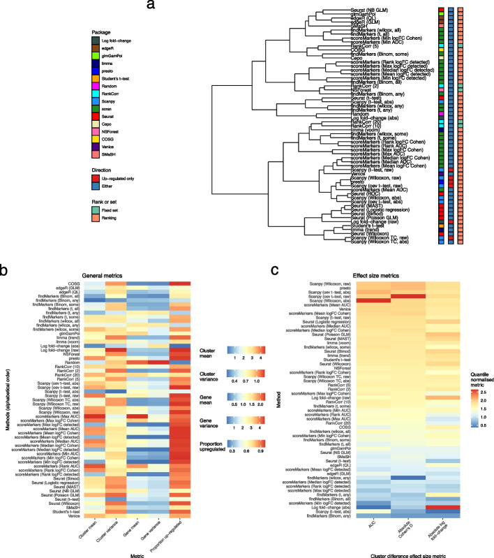
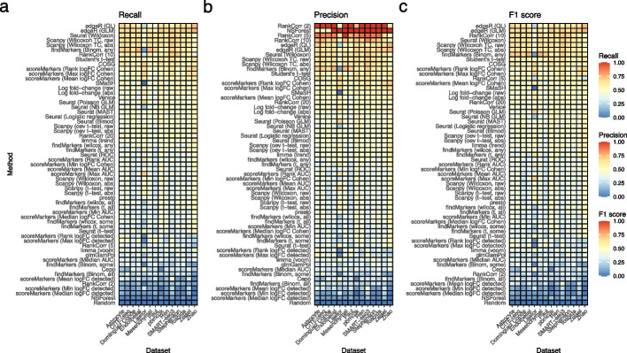
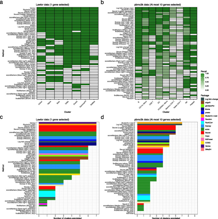
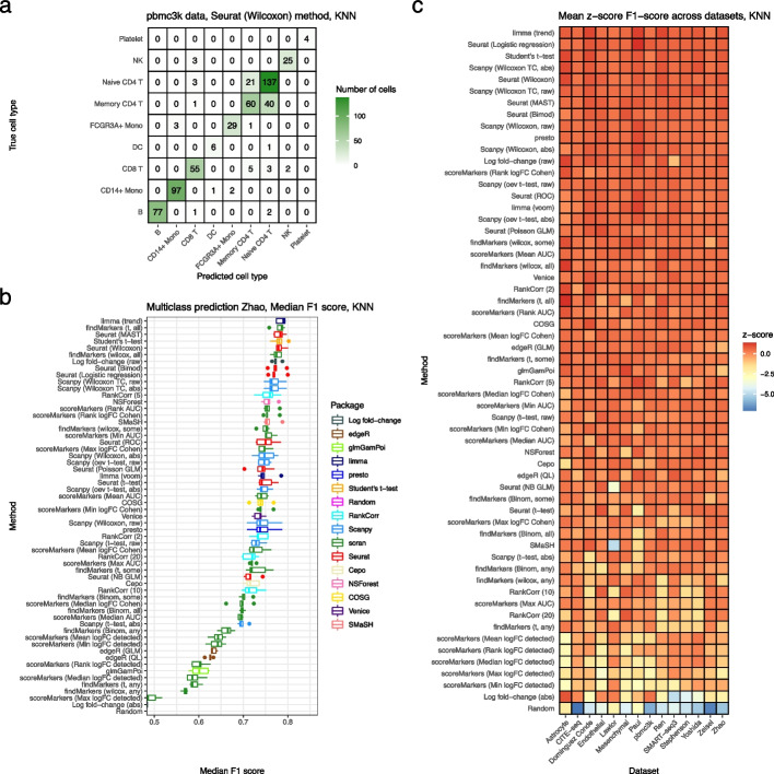
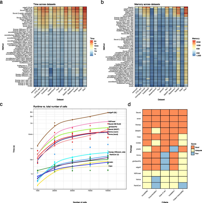
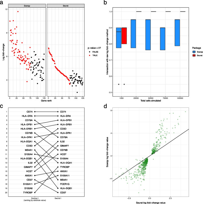
The development of single-cell RNA sequencing (scRNA-seq) has enabled scientists to catalogue and probe the transcriptional heterogeneity of individual cells in unprecedented detail. A common step in the analysis of scRNA-seq data is the selection of so-called marker genes, most commonly to enable annotation of the biological cell types present in the sample. In this paper we benchmarked 56 computational methods for selecting marker genes in scRNA-seq data. The performance of the methods was compared using 10 real scRNA-seq datasets and over 170 additional simulated datasets. Methods were compared on their ability to recover simulated and expert-annotated marker genes, the predictive performance and characteristics of the gene sets they select, their memory usage and speed and their implementation quality. In addition, various case studies were used to scrutinise the most commonly used methods, highlighting issues and inconsistencies. Overall, we present a comprehensive evaluation of methods for selecting marker genes in scRNA-seq data. Our results highlight the efficacy of simple methods, especially the Wilcoxon rank-sum test, Student’s t-test and logistic regression. All code used in the evaluation, including an extensible Snakemake pipeline, is available at: https://gitlab.svi.edu.au/biocellgen-public/mage_2020_marker-gene-benchmarking .
Overview
The claims and statistics of this paper haven’t been checked yet.
Run the check — free, no account needed. It reads the open-access text and checks the sources it cites.
Integrity signals
Registry
Cites
Statistics
Figures
Verification
Claims the paper makes
The claims and statistics of this paper haven’t been checked yet.
Run the check — free, no account needed. It reads the open-access text and checks the sources it cites.
Claims other papers make about this one
Each is checked against this paper’s own text: does it say what the citing paper says it does?
In the citing paper
“For this purpose, Wilcoxon rank-sum tests performed best, but owing to the nature of clustering, P values can be inflated and might lead to false discoveries, as the same data are used to define the labels that we test for differences between60,61.”
From Best practices for single-cell analysis across modalities (2023) · cites this paper as [60]
In the citing paper
“For this purpose, Wilcoxon rank-sum tests performed best, but owing to the nature of clustering, P values can be inflated and might lead to false discoveries, as the same data are used to define the labels that we test for differences between60,61.”
From Best practices for single-cell analysis across modalities (2023) · cites this paper as [60]
Self-check
Percentages, sums and reported differences re-computed from the paper’s own numbers.
The self-check needs the paper’s full text.
Citations
Cites
Controlling the False Discovery Rate: A Practical and Powerful Approach to Multiple Testing
Benjamini, Y., & Hochberg, Y. (1995) · Journal of the Royal Statistical Society Series B: Statistical Methodology · doi:10.1111/j.2517-6161.1995.tb02031.x · Cited by 109,482
Integrated analysis of multimodal single-cell data
Hao, Y., Hao, S., Andersen-Nissen, E., Mauck, W. M., Zheng, S., Butler, A., Lee, M. J., Wilk, A. J., Darby, C., Zagar, M., et al. (2020) · doi:10.1101/2020.10.12.335331 · Cited by 15,508
Smyth, G. K. (2004) · Statistical Applications in Genetics and Molecular Biology · doi:10.2202/1544-6115.1027 · Cited by 11,829
SCANPY: large-scale single-cell gene expression data analysis
Wolf, F. A., Angerer, P., & Theis, F. J. (2018) · Genome Biology · doi:10.1186/s13059-017-1382-0 · Cited by 8,881
Scenic: single-cell regulatory network inference and clustering.
Aibar, S., González-Blas, C. B., Moerman, T., Huynh-Thu, V. A., Imrichova, H., Hulselmans, G., Rambow, F., Marine, J.-C., Geurts, P., Aerts, J., et al. (2017) · Nature Methods · doi:10.1038/nmeth.4463 · Cited by 6,520
voom: precision weights unlock linear model analysis tools for RNA-seq read counts
Law, C. W., Chen, Y., Shi, W., & Smyth, G. K. (2014) · Genome Biology · doi:10.1186/gb-2014-15-2-r29 · Cited by 6,155
McCarthy, D. J., Chen, Y., & Smyth, G. K. (2012) · Nucleic Acids Research · doi:10.1093/nar/gks042 · Cited by 5,195
Self-citationThe single-cell transcriptional landscape of mammalian organogenesis
Cao, J., Spielmann, M., Qiu, X., Huang, X., Ibrahim, D. M., Hill, A. J., Zhang, F., Mundlos, S., Christiansen, L., Steemers, F. J., et al. (2019) · Nature · doi:10.1038/s41586-019-0969-x · Cited by 4,490
Finak, G., McDavid, A., Yajima, M., Deng, J., Gersuk, V., Shalek, A. K., Slichter, C. K., Miller, H. W., McElrath, M. J., Prlic, M., et al. (2015) · Genome Biology · doi:10.1186/s13059-015-0844-5 · Cited by 3,159
Cell types in the mouse cortex and hippocampus revealed by single-cell RNA-seq
Zeisel, A., Muñoz-Manchado, A. B., Codeluppi, S., Lönnerberg, P., La Manno, G., Juréus, A., Marques, S., Munguba, H., He, L., Betsholtz, C., et al. (2015) · Science · doi:10.1126/science.aaa1934 · Cited by 3,124
Research works printed but not linked: 7
- 10.1038/s41592-019-0535-3 · DOI · Paper page
- 10.1038/s41467-021-25960-2 · DOI · Paper page
- 10.1016/j.cell.2021.04.048 · DOI · Paper page
- 10.2307/2346101 · DOI
- 10.1186/s12859-020-03641-z · DOI
- Hadley Wickham . ggplot2: Elegant Graphics for Data Analysis. Springer-Verlag New York, 2016. ISBN 978-3-319-24277-4. URL https://ggplot2.tidyverse.org.
- 10.12688/f1000research.9501.2 · DOI
Cited by
Sorted by citations
Best practices for single-cell analysis across modalities
Heumos, L., Schaar, A. C., Lance, C., Litinetskaya, A., Drost, F., Zappia, L., Lücken, M. D., Strobl, D. C., Henao, J., Curion, F., et al. (2023) · Nature Reviews Genetics · doi:10.1038/s41576-023-00586-w · Cited by 1,051
“Common methods for enrichment include hypergeometric tests, GSEA 99,100 or GSVA 101 , which can be applied after DGE analysis or at the individual cell level.”
MethodProfiling cell identity and tissue architecture with single-cell and spatial transcriptomics
Gulati, G. S., D'Silva, J. P., Liu, Y., Wang, L., & Newman, A. M. (2024) · Nature Reviews Molecular Cell Biology · doi:10.1038/s41580-024-00768-2 · Cited by 347
Systematic comparison of sequencing-based spatial transcriptomic methods
You, Y., Fu, Y., Li, L., Zhang, Z., Jia, S., Lu, S., Ren, W., Liu, Y., Xu, Y., Liu, X., et al. (2024) · Nature Methods · doi:10.1038/s41592-024-02325-3 · Cited by 220
Comparison of Transformations for Single-Cell RNA-Seq Data
Ahlmann-Eltze, C., & Huber, W. (2021) · doi:10.1101/2021.06.24.449781 · Cited by 148
Desta, G. M., & Birhanu, A. G. (2025) · Acta Biochimica Polonica · doi:10.3389/abp.2025.13922 · Cited by 134
Metadata
- Authors
- Pullin, J. M., & McCarthy, D. J.
- Affiliations
- The University of Melbourne (AU)
- Corresponding author
- McCarthy, Davis J.
- Venue
- Genome biology
- Publisher
- openRxiv
- Published
- 2022-05-10
- Volume
- 25
- Issue
- 1
- Pages
- 56-56
- ISSN
- 1465-6906 (ISSN-L)
- PMC
- PMC10895860
- OpenAlex
- W4392167979
- Cited by
- 122
- References
- 72
- Citations by year
- 2026: 43 · 2025: 46 · 2024: 23 · 2023: 10
- FWCI
- 15.20
- Type
- journal article
- Language
- en
- Open access
- gold
- doi.org
- Licence
- cc-by
- Locations
- Genome biology (publishedVersion, cc-by)
- bioRxiv (Cold Spring Harbor Laboratory) (acceptedVersion, cc-by-nd)
- PubMed Central (publishedVersion, cc-by)
- PubMed (publishedVersion)
- DOAJ (DOAJ: Directory of Open Access Journals) (submittedVersion)
- Minerva Access (University of Melbourne) (submittedVersion, cc-by)
- Funders
- Baker Foundation (GNT1162829)
- University of Melbourne
- Medical Research Council
- National Health and Medical Research Council (1162829, 1112681, 1195595)
- Topics
- Life Sciences › Biochemistry, Genetics and Molecular Biology › Molecular Biology › Single-cell and spatial transcriptomics
- Life Sciences › Biochemistry, Genetics and Molecular Biology › Molecular Biology › Gene expression and cancer classification
- Life Sciences › Biochemistry, Genetics and Molecular Biology › Molecular Biology › Genomics and Phylogenetic Studies
- Keywords
- marker gene selection, single-cell RNA sequencing, benchmarking, cell type annotation, Mann-Whitney test, Student's t-test, logistic regression, simulated data, computational performance
- MeSH terms
- Exome Sequencing, Software, Sequence Analysis, RNA, Gene Expression Profiling, Single-Cell Analysis
About these checks
Registry, retraction, Cites and statistics results are computed, not judged, with one exception: a printed reference that no index lists is read once by a model before it counts as a citation error. Claims are extracted by a model and kept only when their quote appears verbatim in the text; each cited source is then checked, with a model’s help, for whether it says what the claim relies on. Those verdicts can be wrong — read the claim’s quote and the cited source before relying on one.
Statistics and arithmetic are recomputed, not judged.
Confidence bands are shown only for fields calibrated on our annotated test set. None is calibrated yet, so no band is shown.
What counts as a claim ›How we measure confidence ›How we check this ›
Are you an author, or do you see a problem with this page? Request a review
